| Home | Contact Us | Articles |
| Books - DVDs | Stadia Pix | Programme Generator |
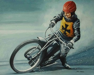
Legtrailer Art
Artist John Proud has produced these works showing some of the sport's greats in classic action.
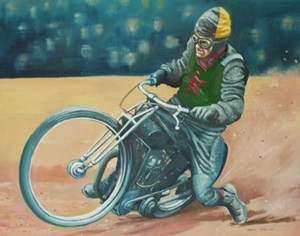
George Newton
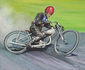
Bluey Wilkinson
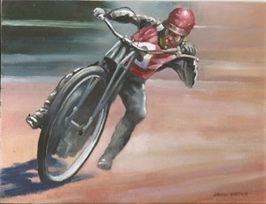
Peter Craven
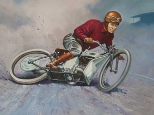
Sprouts Elder
Tom Farndon
All of the above paintings are now available as artist signed prints.
Image size 14.5 inches x 10.5 inches.
Printed on archive quality paper suitable for mounting in a standard 20 x16 inch frame.
Price: �20 each plus �3.00 P&P ( �3.50 P&P overseas )
Cheques made payable to: John Proud
26 Keyes Gardens
Jesmond
Newcastle upon Tyne
NE2 3QX
UK.
This article was first published on 17th March 2011

"Fantastic art. Legtrailers were a bit before my time (I started watching Speedway at Long Eaton in 1963). Looking at these painting certainly gives me a feeling of how it used to be back in the day. A couple of ideas for new paintings if I may. The Tom Fardon painting you have done is excellent. But perhaps (in my opinion) the action photo of Tom racing Dickie Case in one of his last match races would make a tremendous painting. The photo shows Dickie holding the inside line, with Tom almost hanging off his machine trying to get around the outside. Finally I love to see an action shot of the legendary Jack Parker, who said he could ride either foot forward or legtrail, which ever the fans wanted."
"Nice paintings, just curious as to how the artist knows all the colours involved. Did he find some rare colour photos or is there some artistic license used? I realise that the various race jackets are well known, but I am just curious about the reat of the kit. I was asked last year to do a painting of someones great uncle in race action, but there was only a grainy black and white photo available and I wasn't confident that I could really work from it. These pictures by Mr Proud are excellent though. "
"Do not want to seem picky, but! The West Ham racing colours are totally wrong. Wrong type, wrong colours, wrong design. They should be Red and Blue, Not Claret and Blue, The Red should be at the top not Blue, The Crossed Hammers would have only been on the front of the race jacket, not on the back as well."
"Robert I think the colours are red and blue albiet slightly darker than you would remember, also pre war the race jacket were blue on top! As for being picky I agree the Hammers would only be on the front and as you can only see the front that is a bit picky! :-) By the way the crossed hammers only appeared after about 1935, the first year the race jackets were white, then up to 1932 they where red and blue quarters after that blue and red halves. During the War and in 1946 the hammers where not crossed and in 1947 the red bit went on top! I know being such a young chap you may not have seen our Bluey in his pomp :-( Must say I like the painting and a little artistic licence is always acceptable."
"The comments are very interesting. I know I most likely got the West Ham colours wrong - it was mentioned on the website guestbook ages ago - unfortunately there's nothing I can do about it now. As for the colours. Well I actually saw George Newton racing for either Fleetwood or Wigan back in the 'Forties so I think I got that one right. I began watching speedway in 1946 and many of the guys were using equipment they had stored during the war so I have some idea what pre-war racing looked like, although from this distance of time there are many details I do not remember. At Newcastle for instance we had Norman Evans, Syd Littlewood and Charlie Spinks, all of whom had ridden in the 'Thirties. One good source of reference is the cigarette card issue (1937?) which was produced in colour. However it is the colour of the track which has given me the most trouble - cinders ? shale ? or Johnnie Hoskins' silver sand treatment. From an artistic viewpoint if you try to be too accurate colourwise you'd most likely end up with a pretty drab and boring picture. Maybe we have fogotten just how dull and frankly dirty things looked in those pre-smoke abatement days. But the mistakes are entirely mine. Just put it down to artistic licence."